CCOF Foundation Website Restructure
The CCOF Foundation has a wealth of resources for organic farmers and those transitioning to organic. Grants, technical assistance, trainings—they’ve got it all, and they serve quite the variety of farmers and future farmers.
However, as so many nonprofits do, they had organized their website by program. This is helpful if you are on staff, or are already familiar with the programs, but can be challenging if it’s your first time learning about what the organization has to offer.
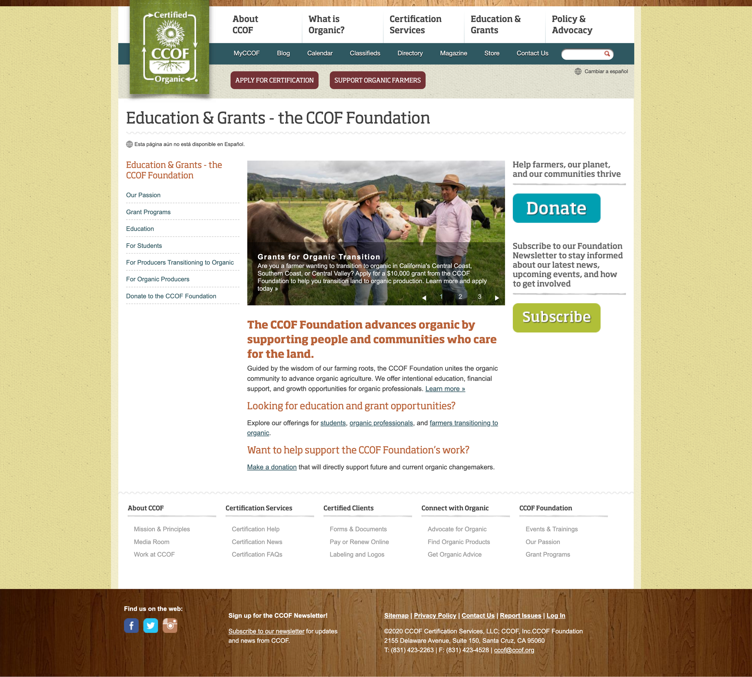
I partnered with CCOF marketing communications staff and the CCOF Foundation team to inform a new website structure. Instead of putting programs first, we put people first. Who was our audience? What did they need? How would they best find what they needed?
After a careful discovery phase, a look at other communications materials that were already serving the CCOF Foundation well, and some work on customer journeys, we crafted a new website architecture that is much more user friendly.
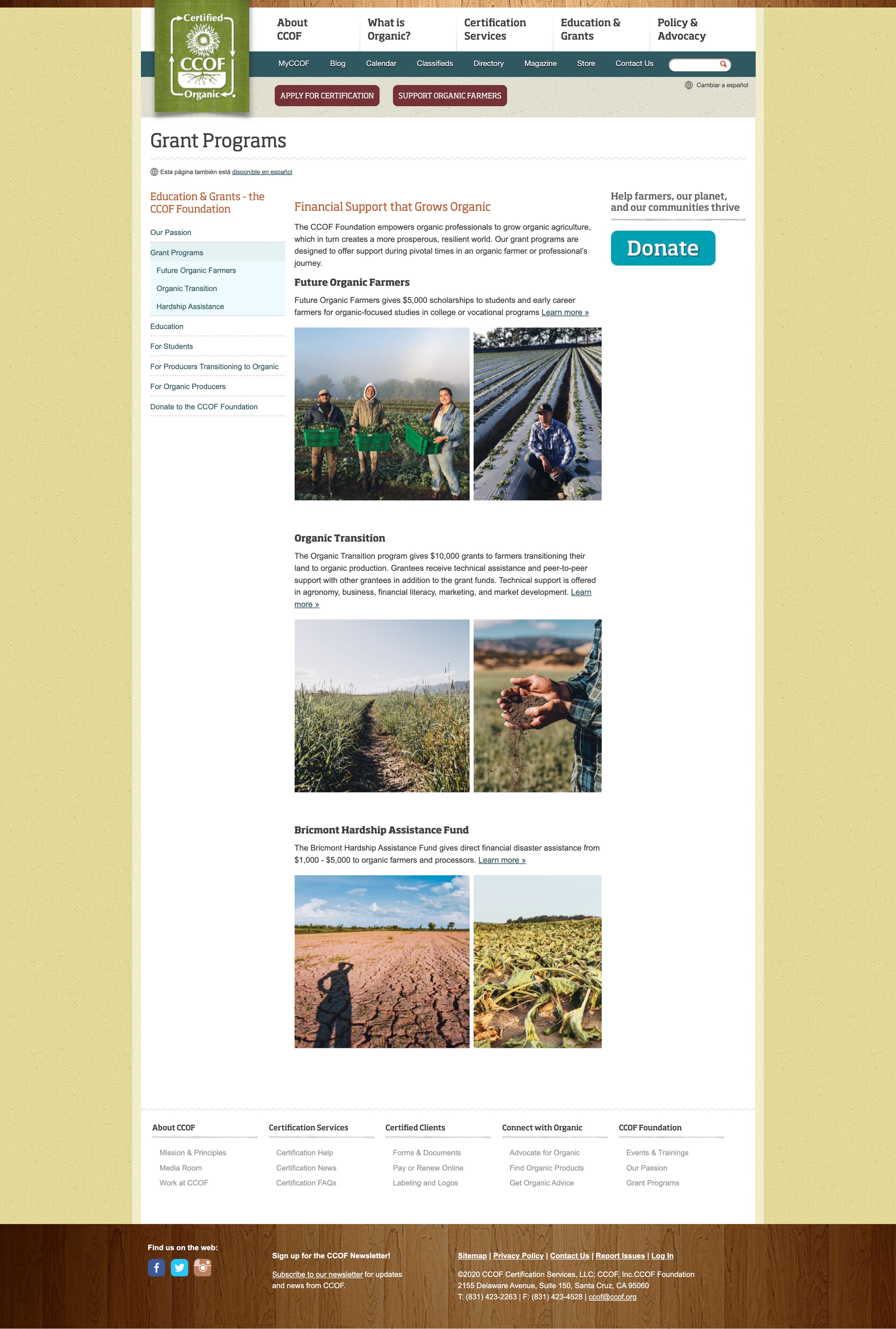
Now, the left navigation provides a starting point for each distinct audience, as well as simple sections dedicated to program type, for donors to quickly and efficiently understand what their support does.
Is your website structure as user friendly as it could be? Let’s chat!


