Case Study
North Coast Co-op Member Engagement
A revitalized engagement program brought more member-owners to North Coast Co-op’s already impressive member base.
When I came on board at North Coast Co-op, the membership program had been in place since the Co-op’s founding in the 1970s. With more than 15,000 member-owners, there was tremendous brand equity already established.
However, membership growth had stagnated, and many people didn’t understand why they should become a member; non-members could shop at the stores, as well. However, the Co-op’s sales were consistently better with members.
It was time to reinvigorate the program and the messaging around being a North Coast Co-op member, without alienating those who had been members for decades.
We took stock of existing member benefits and communications channels, and decided to mix things up a bit:
The Co-op News, a monthly newsletter, would take a longer and more appealing format, and move to a quarterly schedule
We started a local Business Partner Program to symbiotically boost visibility of local businesses and the Co-op, while providing members with an additional tangible benefit
We worked with the merchandising team to create member-only deals on a regular basis
We revisited the idea of “local,” leading to a highly engaging campaign and new in-store messaging
We launched the long-planned Co-op Access Program to help improve food access equity in the community
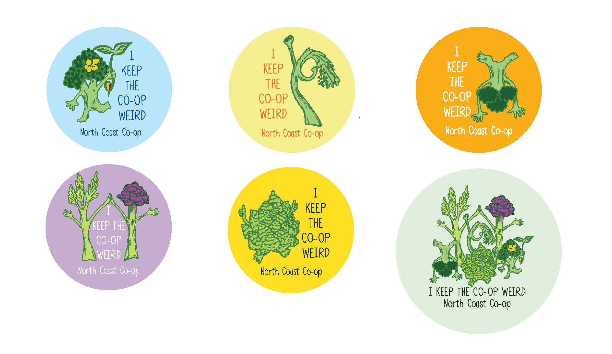
We started an “I Keep the Co-op Weird” campaign that boosted merchandise sales and strengthened personal connections between staff and members
We revamped our membership materials, being sure the messaging fostered pride in all of the above
It worked! Today, North Coast Co-op continues to thrive and engage with more members month after month.
Unless otherwise noted, I wrote and art directed all collateral shown below. Pieces written by others were edited by me.
The Making Local Meaningful campaign sought feedback from members, and consisted of many articles and in-person input sessions.
It culminated in new in-store signage and an ad campaign that featured local producers. It was an excellent and truly meaningful way to engage with members.
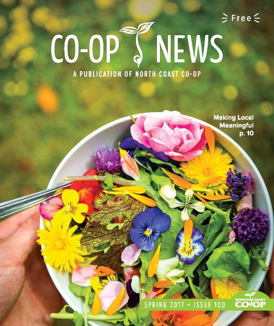
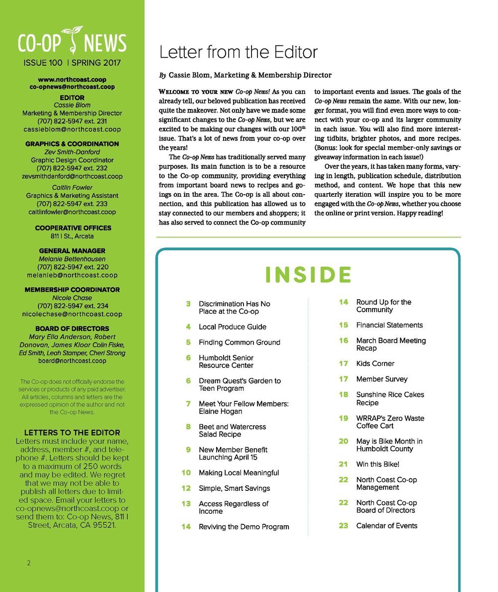
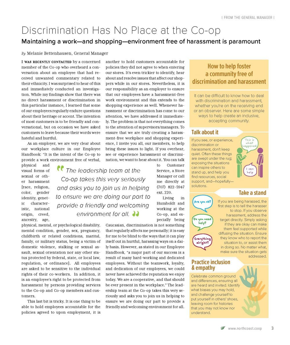
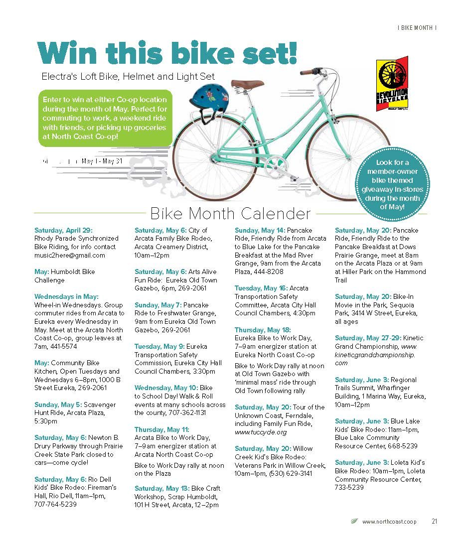
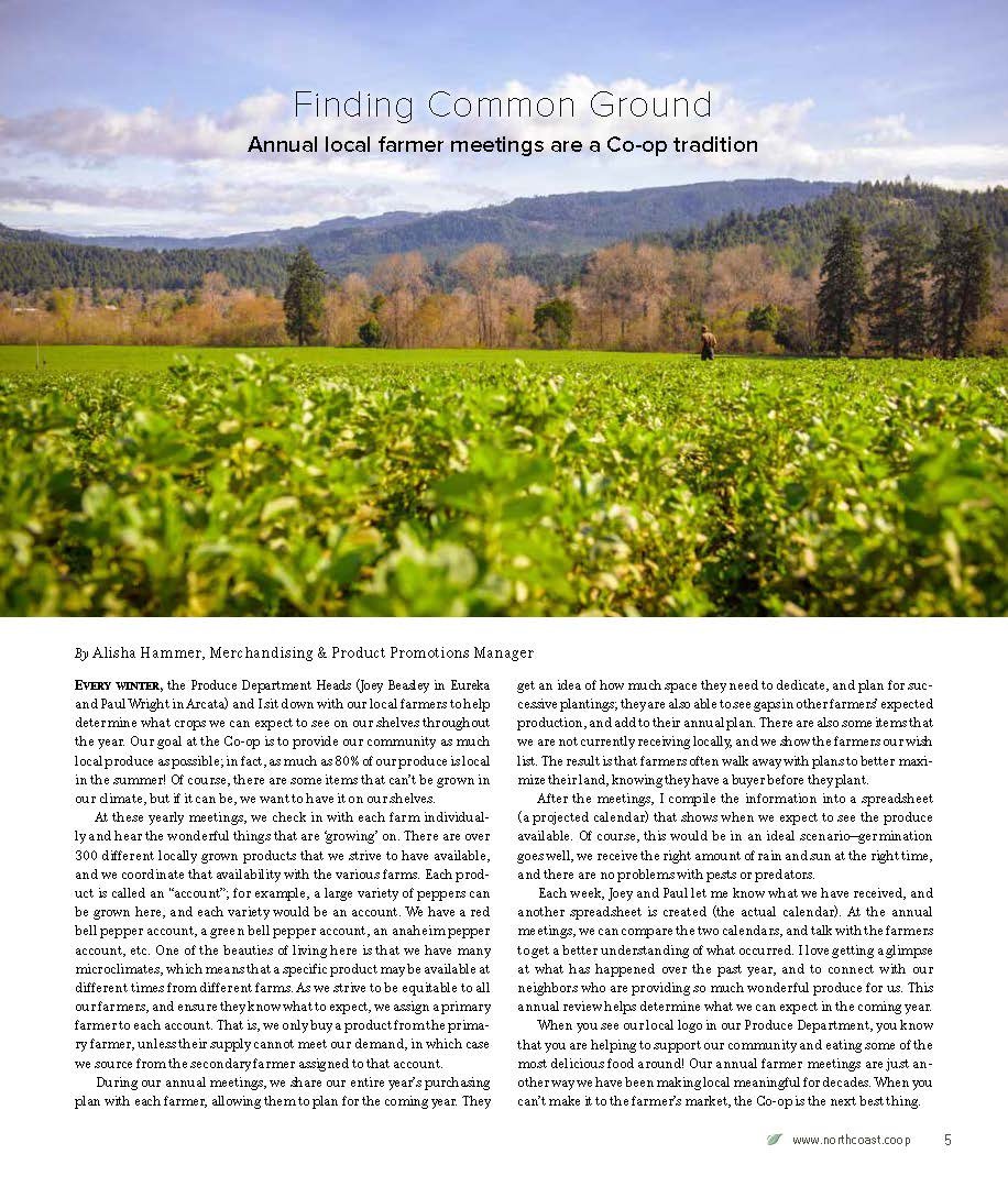
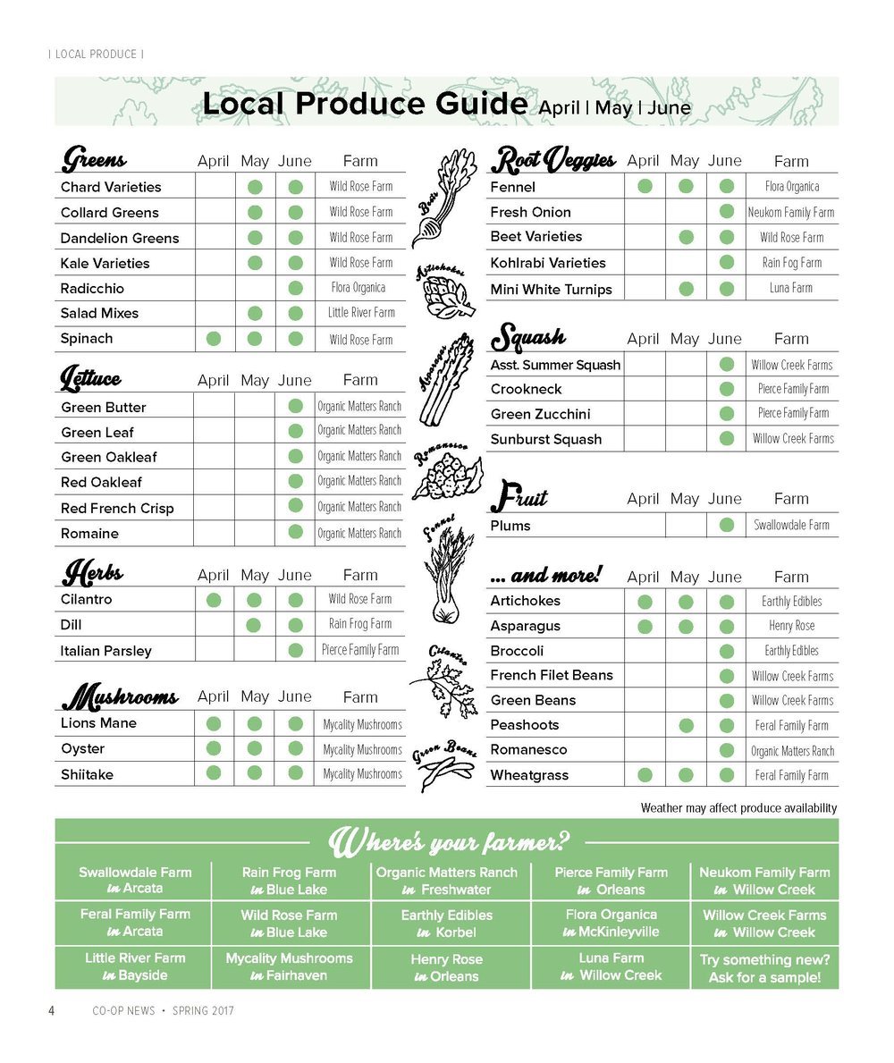
The Co-op News redesign included a longer format with more focus on white space and captivating imagery. It also included new features that were particularly valuable to members, like the seasonal Local Produce Guide. After the redesign, readership increased (yes, of a printed publication!).
“I Keep the Co-op Weird” included a variety of merchandise that was either sold or given away by store staff while engaging in conversations with members.
The campaign strengthened members’ connections to North Coast Co-op, and merch sales increased. The art was created by (very talented!) in-house graphic designers; I acted as creative director.

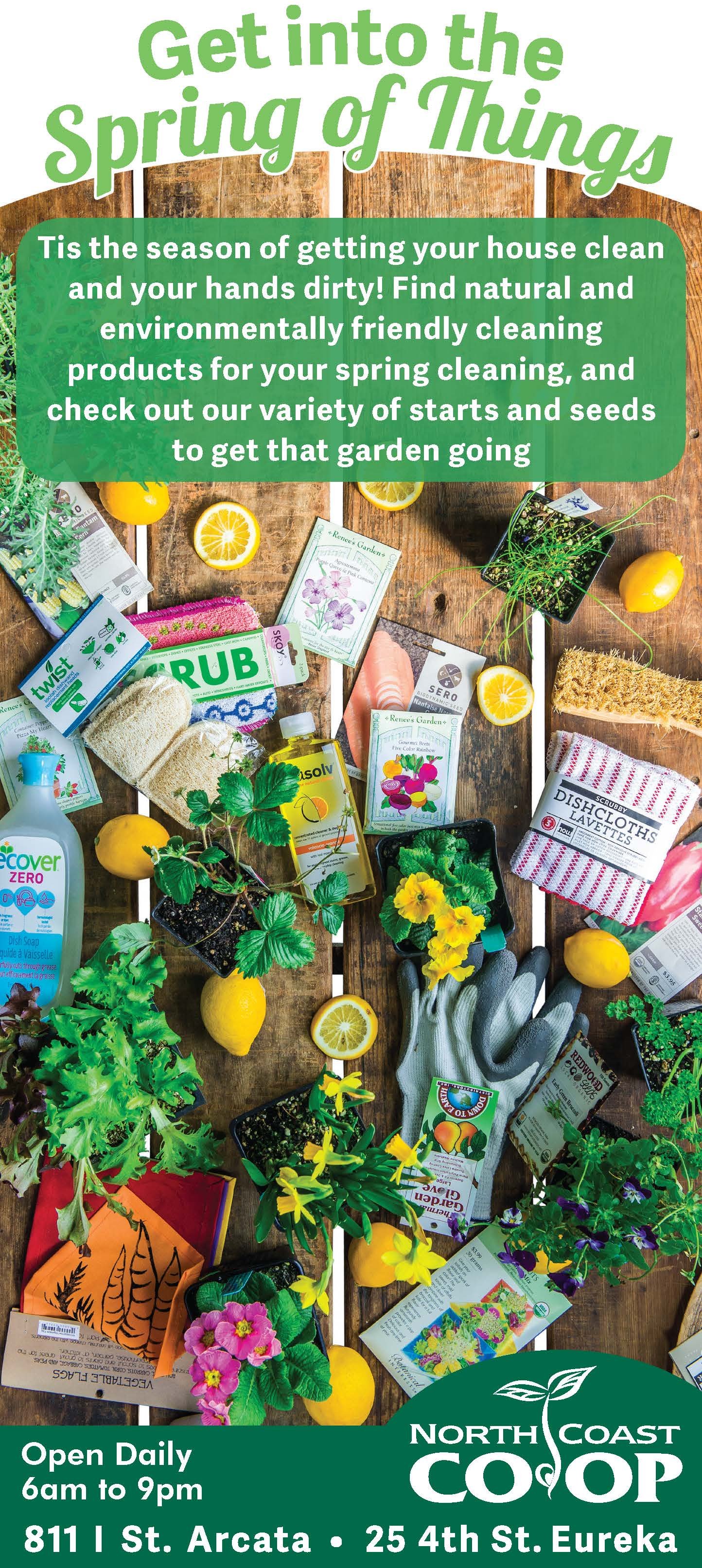
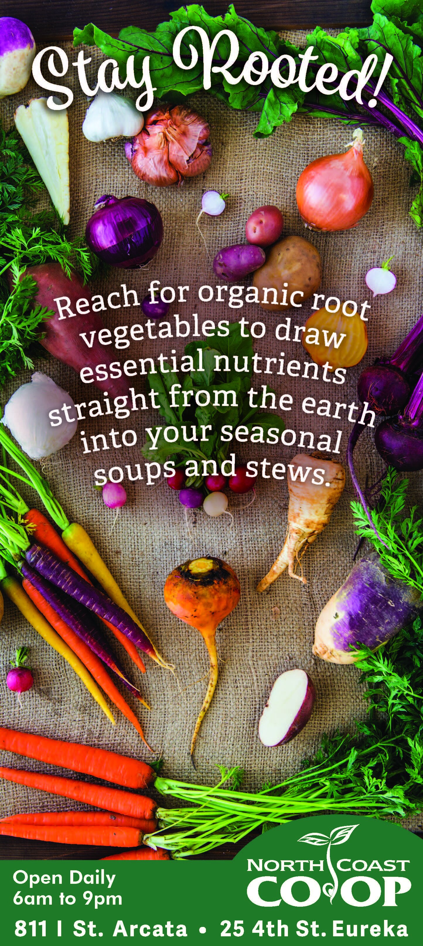
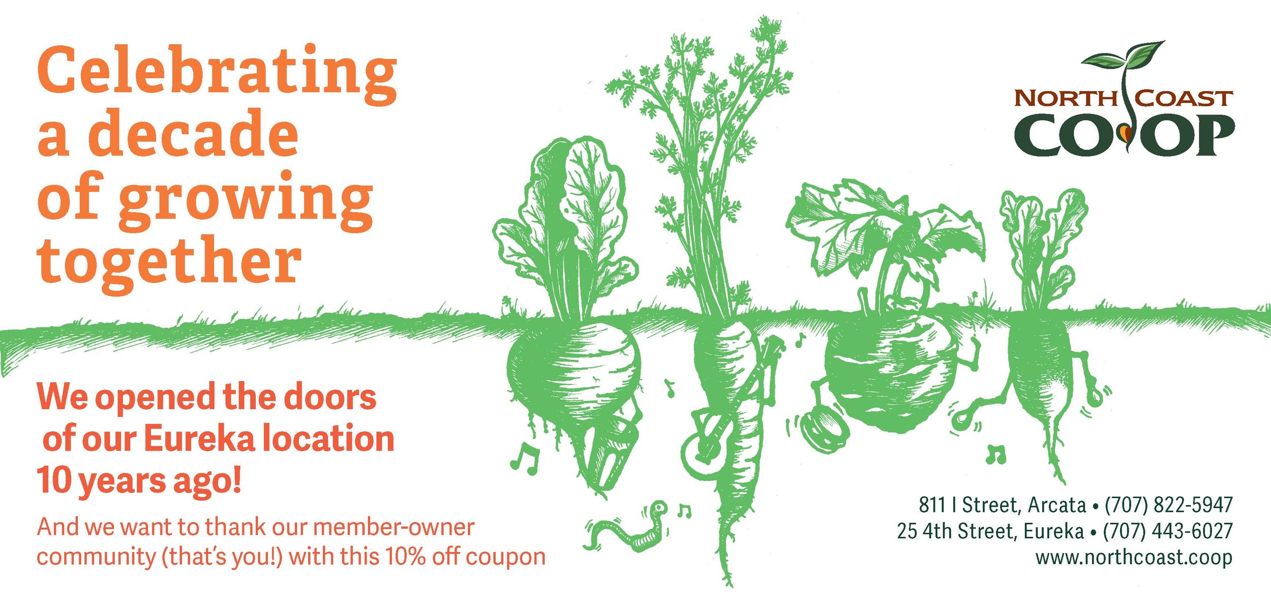
Advertisements during this time were meant to add value to our audience’s experience. We focused on vibrant imagery, simple copy, and an inviting tone.
